Full waveform data of the Dublin 2015 scan
This report presents some basic exploration of the full waveform LiDAR data acquired in Dublin in 2015.
Pulse repetition frequency
Pulse repetition frequency (PRF) is the number of recorded pulses (i.e. laser shots) per second. This section loads and plots PRF of flight path #130804. The PRF data (i.e. freq-f130840.csv) was computed by umg.query.fwf.FWFComputeHistorgram in lidardb-cli.
import pandas
import matplotlib.pyplot as plt
import datetime
import time
from IPython import display
from matplotlib.mlab import griddata
import numpy as np
df = pandas.read_csv('data/freq-f130840.csv', sep=',',parse_dates=['datetime'])
df.dtypes
df.head(5)
plt.rcParams['figure.figsize'] = (15,3)
plt.plot(df['datetime'], df['prf']/1000,linewidth=1, color='black')
plt.axvline(datetime.datetime(2015,3,26,13,9,0),linewidth=3, color='red')
axes = plt.gca()
axes.set_ylim([200,280])
plt.title('Pulse repetition frequency diagram - Flight path #130804')
plt.xlabel('Time')
plt.ylabel('Pulse repetition frequency (kHz)')
plt.show()

Pulse geometry
The following figure presents 8,080 pulses acquired during an interval of 30 milli-seconds during the above flight path #130840, from 13:09:00.000 to 13:09:00.030. The period is denoted by the red line in the Pulse Repetition Frequency diagram above. The pulse geometry (i.e. pls-130900000-130901030.dxf) was computed by umg.fwf.query.FWFExtractPulses.
An interactive 3D visualization of the data is available at this link. Choose '3D View' on the left pannel and 'Dark Sky' environment (from the gear button on the bottom, floating menu) for the best visual effects.
Below is the associated point cloud for reference. This flight swatch swept through the ground surface, several multi-storey buildings and a couple of small trees.

Wave data in the temporal domain
This section plots the wave data in the time domain without considering the spatial context.
wavedf = pandas.read_csv('data/wvs-130900000-130901030.csv', sep=',',index_col=0)
#wavedf.dtypes
wavedf.head(5)
The following code sinnipet sequentially plots the first few wave segments in wavedf by their order in the table. The number of segments to be plotted can be specified in range(<number-of-segments>)
plt.cla()
plt.rcParams['figure.figsize'] = (15,5)
plt.title('Interactive waveform plot')
plt.xlabel('Time (bins)')
plt.ylabel('Amplitude')
for i in range(500):#wavedf.shape[0]-1
    ts = wavedf.iloc[i]
    display.clear_output(wait=True)
    ts.plot(linewidth=.1, color='black')
    display.display(plt.gcf())
    time.sleep(.001)

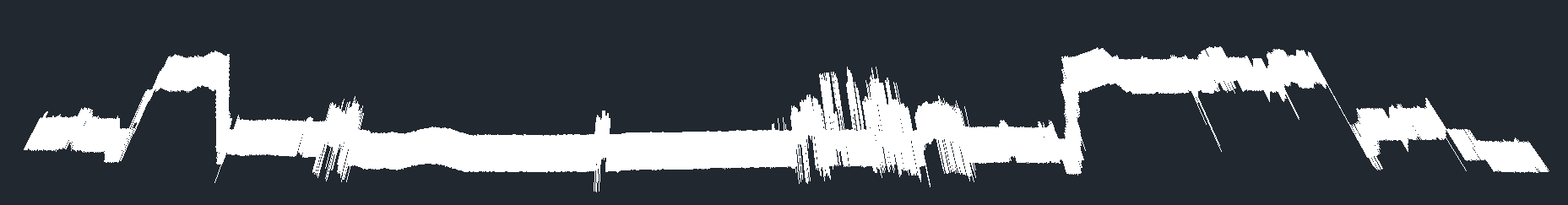
This code snippet plots all the wave segments in wavedf. It will take some time for the plot to complete.
plt.cla()
plt.rcParams['figure.figsize'] = (15,5)
plt.title('Waveform plot for an interval of 30 milli-seconds from 13:09:00.000')
plt.xlabel('Time (bins)')
plt.ylabel('Amplitude')
for i in range(wavedf.shape[0]-1):#wavedf.shape[0]-1
    ts = wavedf.iloc[i]
    ts.plot(linewidth=.1, color='k')
    #display.clear_output(wait=True)
    #display.display(plt.gcf())
    #time.sleep(.001)
plt.show()

Simple target extraction
This section presents a simple computation to detect peaks from the first full waveform recording in the wavedf above and to geo-reference the detected peaks using the associated pulse data. The GPS week timestamp of that measurement is 392940000001 (i.e. 2015-03-26 13:09:00 UTC). Below is a plot of the wave data. The time interval between 2 consecutive wave samples is 1 ns (from the metadata). The dashed curve is the emmitting wave. The another one on the right is the only returning wave segment. The 3 colored bars denotes the peaks manually spotted from the plot.
- Red : The emmitting peak (10 ns from the beggining of its segment).
- Green: The first returning peak (18 ns from the beggining of its segment).
- Blue : The second returning peak (29 ns from the beggining of its segment).
Waveform
plt.cla()
plt.rcParams['figure.figsize'] = (15,5)
plt.title('Wave data of the laser shot at 2015-03-26 13:09:00 UTC')
plt.xlabel('Time (bins)')
plt.ylabel('Amplitude')
plt.axvline(x=10,ls='--',linewidth=3, color='red', label='emitting peak')
plt.axvline(x=18,linewidth=3, color='green',label='returning peak #1')
plt.axvline(x=29,linewidth=3, color='blue', label='returning peak #2')

ts = wavedf.iloc[0]
ts.plot(ls='--',linewidth=1, color='black',label='emitting wave')

ts = wavedf.iloc[1]
ts.plot(linewidth=1, color='black', label='returning wave')

plt.legend()
plt.show()

Waveform correction
Below is the same wave data above after applying the correction using the lookup table (low channel in this case). The meaning of the correction is to "map the the sample values to actually measured physical values" (PulseWaves spec). Compared to the original waveform, the second peak shows up clearer in the corrected waveform. In addition, the corrrection seems to have removed the low noise.
lookupdf = pandas.read_csv('data/lookup-table.csv', sep=',',index_col=0)
plt.rcParams['figure.figsize'] = (15,5)
plt.title('Amplitude correction')
plt.xlabel('Original amplitude')
plt.ylabel('Corrected amplitude')
lookupdf['high'].plot(linewidth=2, color='red', label='high channel')
lookupdf['low'].plot(linewidth=2, color='blue', label='low channel')
axes = plt.gca()
plt.legend()
plt.show()

correctedWave=np.zeros(ts.shape[0])
for i in range (ts.shape[0]):
    if np.isfinite(ts[i]):
        correctedWave[i] = lookupdf.loc[ts[i]]['low']
plt.title('Corrected wave data of the laser shot at 2015-03-26 13:09:00 UTC')
plt.xlabel('Time (bins)')
plt.ylabel('Amplitude (corrected)')
plt.axvline(x=18,linewidth=3, color='green',label='returning peak #1')
plt.axvline(x=29,linewidth=3, color='blue', label='returning peak #2')
correctedts = pandas.Series (correctedWave)
correctedts.plot(linewidth=1, color='black', label='returning wave')
axes = plt.gca()
axes.set_xlim([0,120])
#axes.set_ylim([0,120])
plt.legend()
plt.show()

Additional data for georeferencing
The following are some additional data needed for the geo-referencing the above peaks.
From the pulse header:
| Attribute | Value |
|---|---|
| Offset | [314000, 232000, 0] |
| Scale | [0.001, 0.001, 0.001] |
From the pulse record, extracted from umg.query.fwf.FWFExactMatch using timestamp value of 392940000001.
| Attribute | Value |
|---|---|
| gPSTimestamp | 392940000001 |
| anchorX | 2774946 |
| anchorY | 1509400 |
| anchorZ | 325426 |
| targetX | 2742660 |
| targetY | 1482540 |
| targetZ | 181576 |
| firstReturningSample | 2179 |
| lastReturningSample | 2238 |
| pulseDescriptorIndex | 2 |
From the wave record:
| Attribute | Value |
|---|---|
| Duration from anchor of sampling #0 | -10 |
| Duration from anchor of sampling #1 | 2179 |
Compute the unscaled anchor point (anchor) and the directional vector (d)
offset = np.array([314000, 232000, 0])
scale=np.array([.001,.001,.001])

aNCHOR=np.array([2774946,1509400, 325426])
tARGET=np.array([2742660,1482540,181576])

anchor=aNCHOR*scale+offset
target=tARGET*scale+offset

d=(target-anchor)/1000
Geo-reference the returning peaks
From the point cloud file, we can see 2 returns were acquired at the above timestamp. They are presented in the table below.
| x | y | z | return number | number of returns | timestamp |
|---|---|---|---|---|---|
| 316704.009 | 233450.384 | 9.365 | 1 | 2 | 392940.000001 |
| 316703.661 | 233450.095 | 7.814 | 2 | 2 | 392940.000001 |
We are geo-referencing the waveform peaks to see if the computed returns match with the above points.
First return (the green bar)
durationFromAnchor=2179
durationFromFirstSample=18
# the first return's coordinates:
point=anchor+d*(durationFromAnchor+durationFromFirstSample)
point
deviation = point-np.array([316704.009,233450.384,9.365])
deviation
Conclusion: close enough.
Second return (the blue bar)
durationFromAnchor=2179
durationFromFirstSample=29
# the first return's coordinates:
point=anchor+d*(durationFromAnchor+durationFromFirstSample)
point
deviation = point-np.array([316703.661,233450.095,7.814])
deviation
Conclusion: close enough.
Geo-referencing all wave samples
This section performs georeferencing for all the wave samples collected in the 30 milli-seconds interval from 13:09:00.000. The actual computation is done in Java by umg.query.fwf.FWFExtractFullPoints and result is stored in data/fwf/full-corrected.csv. Below are two visualizations of the result. The first visualization presents the result as an intensity field f(x,y,z)=intensity. The second visualization is an intensity level set defined by f(u,z)=intensity, where u is the along track direction, z is elevation.
fullptsdf = pandas.read_csv('data/full-corrected.csv', sep=',')
fullptsdf.dtypes
x = np.array(fullptsdf['y'])
y = np.array(fullptsdf['z'])
z = np.array(fullptsdf['intensity'])
xi = np.linspace(x.min(), x.max(), 1000)
yi = np.linspace(y.min(), y.max(), 100)
zi = griddata(x, y, z, xi, yi, interp='linear')
Intensity field
plt.rcParams['figure.figsize'] = (20,3)
plt.figure()
cp = plt.contourf(xi,yi,zi)
plt.rcParams['image.cmap'] = 'viridis'
plt.colorbar(cp)
plt.title('Intensity field')
plt.xlabel('u (m)')
plt.ylabel('z (m)')
plt.show()

Intensity level set
plt.rcParams['figure.figsize'] = (20,3)
CS = plt.contour(xi, yi, zi, 255, linewidths=0.05, colors='k')
#CS = plt.contourf(xi, yi, zi, 255,
                  #vmax=abs(zi).max(), vmin=-abs(zi).max())
plt.xlim(x.min(), x.max())
plt.ylim(y.min(), y.max())
plt.title('Intensity level set')
plt.xlabel('u (m)')
plt.ylabel('z (m)')
plt.show()
